
www.TestsTestsTests.com

Avoiding Poor Slide Design PowerPoint Tutorial
Free PowerPoint Online Tutorial
MS Office 2010 – Working with Slides
* Consistent Slide Design
*
Using Font Style Sheets for Presentations
*
How many lines per slide?
Poorly designed slides can be boring and frustrating for your audience.
Do you know what not to do?
Test your PowerPoint skills with the corresponding FREE Online Multiple Choice
Avoiding Poor Slide Design in PowerPoint Test
* Consistent Slide Design
We humans love patterns and consistency. In fact we strive to introduce consistent design in most aspects of our lives, including our architecture, literature, art, media, fashion, car design, webpages, etc. The list can go on. Think of your favorite webpage or magazine: even though each section or page may have differences, the core style is the same and identifiable with the brand of the specific website or magazine.
Consistency of design ensures that people pay attention to the content of a message and do not get distracted by the presentation or formatting. It also makes content from a specific source identifiable and is useful for building a business or personal brand.
Study the screenshot of a sample of slides from a presentation below:
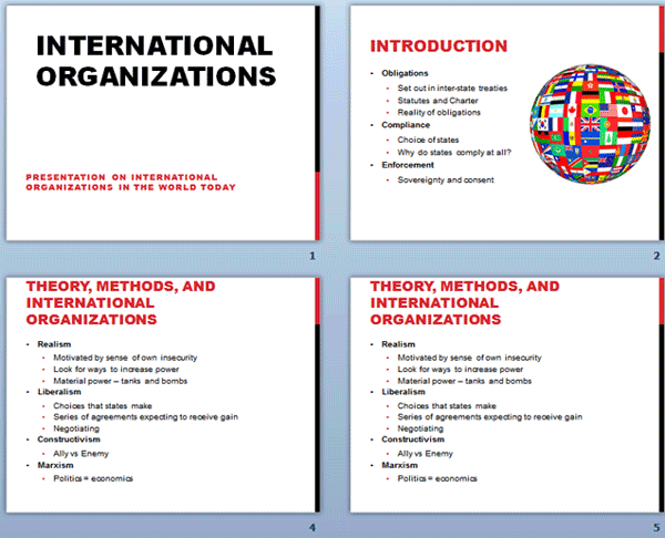
Do you think the above slides demonstrate consistency in design? If yes, why?
Although the color, font and design schemata of the four slides above may not be everyone’s cup of tea, I hope you agree that the design of the slides are consistent.
Let’s examine some of the elements which contribute towards making a presentation (a collection of slides) consistent:
- * The slide background color, design and layout.
- * The font and font color.
- * Bullets and numbering.
- * Headings and subheadings.
- * Graphics (if used
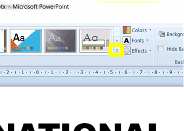
The easiest way of achieving the above, is to use the built in Design Themes Gallery:
1. On the Ribbon, click on the Design tab.
2. In the Themes group, click on the More button (circled in yellow in the screenshot below) to expand the Gallery:
3. To see what the different themes in the Gallery will look like when applied to your slides, hover your mouse cursor over each theme.
4. Once you find a theme that is fits in with your requirements, simply click the theme to apply it.
Using Themes will ensure consistency across all your slides. Whether you choose to use themes or to manually format slides, always scroll through the whole presentation a few times, ensuring you have applied the same formatting elements throughout the presentation. If possible, print out your slides and review the printed copies.
* Using Font Style Sheets for Presentations
Imagine you’re reading a novel where pages contain different font sizes and even colors. Unless it is intentional, chances are you will think the book has been misprinted and will find it irritating or difficult to read. If you are able to read such a book comfortably, you may find yourself being distracted by the multicolor font of differing sizes.
Study the screenshot of a sample of slides from a presentation below:
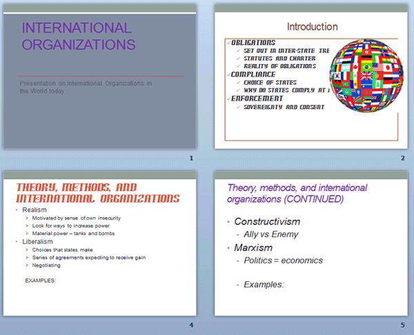
You may notice that different font colors, types and sizes were used for main headings, sub headings and bullet points.
Viewers of this presentation may have difficulty following points and main ideas in this presentation as these have not been formatted in the same way. This creates the idea that the slides in the presentation are separate from each other and not related to the same subject. It may be tempting to separate ideas in a presentation by using different font styles and colors, but I’m sure you will agree, judging from the image above, that this is not a great idea.
Many businesses and individuals prefer to create a signature style for themselves to ensure they always use the same collection of fonts, font colors and sizes across all slides and presentations.
Create a style sheet for the font style, color and sizes to use for different content type on your slides. Your style sheet may look something like this:
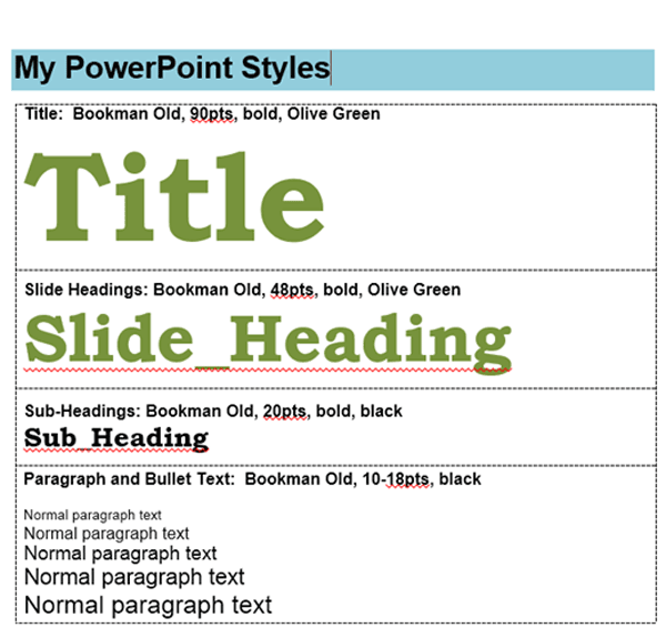
A style sheet can be distributed to different departments in the same company, university or group, to ensure everyone uses the same font styles when creating presentations, in addition to distributing a template containing the preferred formatting.
Another way of ensuring font consistency across all slides, is to use the built-in Design Themes tool to modify font style and color to ensure these are consistent throughout a presentation.
To change the fonts used in a presentation:
1. Click on the Design tab on the Ribbon and in the Themes group, click on the Fonts button.
2. Select one of the custom built-in font styles to apply to your slides.
If none of the built-in font styles match your requirements:
1. Create a custom font combination by clicking on Create New Theme Fonts at the bottom of the Fonts list.
2. In the Create New Theme Fonts dialogue box select a font for the headings and body text.
3. Give your custom font combination a name and then click on save. Your font style will now be available from the Fonts dropdown list under the Custom heading.
To change the color theme of a font:
1. Click on the Design tab on the Ribbon and then click on the Colors button.
2. Click on the Create New Theme Colors button at the bottom of the list.
3. In the Create New Theme Colors dialogue box, experiment with changing the Text/Background colors at the top of the list in the box.
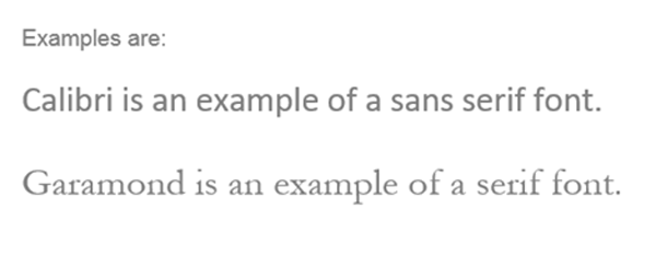
Whichever method you choose to ensure consistency throughout your slides with regards to fonts, always review all your slides a few times after creating your presentation and ensure you used the same combination of font styles all throughout. As a general rule, it is recommended to never use more than three types of fonts in a single presentation. Another useful guideline is to use sans serif fonts as these tend to appear cleaner and easier on the eye. Serifs are the little edges that appear on the letters in certain fonts and sans serif means fonts without these little edges. Although serif fonts are easier to read where there are a lot of text, you should not be using a lot of text on a PowerPoint slide!
A final consideration is to ensure your font is an easily readable size, color and type. Although it is tempting to use a fun-looking handwriting font, ask yourself whether your audience will be able to read your slides from a distance.
* How many lines per slide?
Imagine you are stuck in a room with 22 genetically modified chickens, 22 genetically modified angry chickens. You face the grim, if somewhat embarrassing reality, of being attacked and eaten by livestock. Your only escape is in the form of document labelled Instructions taped to the back of the door to the room. Would you want a detailed document spanning many pages containing bullet points of how the door was manufactured, where it came from, who was involved in its creation, etc. OR would you prefer a clear succinct document with only a few key instructions on how to open the door and escape the chickens?
In the same way slides in PowerPoint should contain only key thoughts and not every possible bit of information on a topic. PowerPoint presentations rely on the speaker conveying the details of the message and not the content of the slides. Committing your every thought and idea in great detail onto a slide, is considered poor slide design.
As a general rule, try to insert only one main point per slide, a sub-point (if applicable) and about four to five bullet points. Each line should be no longer than around five words. This will help to keep your audience focused on what you are saying and will make your points far more memorable than if they were getting lost in dozens of bullet points.
Decide what the main theme of your talk or message will be and then create an outline. Fill the outline in by subdividing the talk into different main headings, subheadings and bullet points. Combine ideas to make your message more powerful and snappy to your audience.
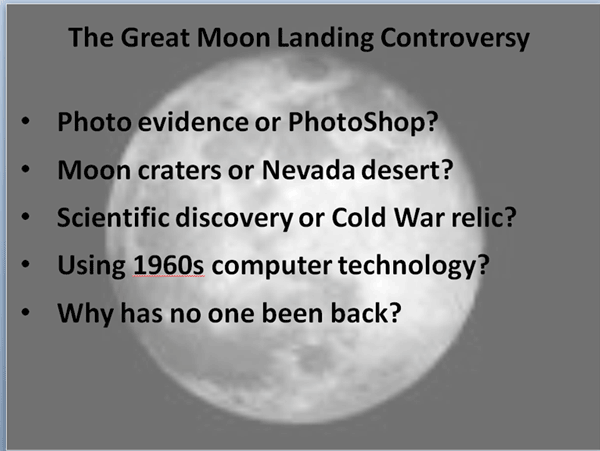
Consider the slide below:

If you were in a presentation where slide after slide resembling the above was displayed, what would your impression be? Would it be easy to read the above and listen to the speaker at the same time? Would you be able to remember the main thoughts the speaker is trying to bring across?
Now consider the same slide with its contents revised, below:
Each bullet point has been reworded to contain a key thought only. Compare this slide to the first one. I’m sure you will agree that the content of the second slide will be far easier to follow and remember than that of the first slide.
Keeping the elements you learnt about in this tutorial regarding consistency in design, font use and slide content, evaluate all presentations you come across in your personal and professional life and see how well (or badly) they fair in these categories.
Woohoo! Now that you have done the tutorial:
Test your PowerPoint skills with the corresponding FREE Online Multiple Choice
Avoiding Poor Slide Design in PowerPoint Test
TRY THE NEXT TUTORIAL: Working with Text Boxes & Placeholders PowerPoint Tutorial
TRY THE NEXT TEST: Working with Text Boxes & Placeholders PowerPoint Test