
www.TestsTestsTests.com

What Makes a Good PowerPoint Presentation?
Free PowerPoint Online Tutorial
MS Office 2010
* Carefully Planned Content
* Appropriate Slide Design
*
Using Multimedia Elements
*
Managing PowerPoint During Your Talk
PowerPoint is abused and overused. Do you know the key points to making a good PowerPoint presentation?
Test your PowerPoint skills with the corresponding FREE Online Multiple Choice
Planning Your PowerPoint Presentation Test (this test cover the first 2 tutorials)

* Carefully Planned Content
Imagine you had an essay due for school. You spend very little time writing the content of the essay but your formatting is stunning. You have created an artful cover and the document formatting is on par with the most professional of eBook designs. Your professor may be impressed with your design talent, but unless it is a graphic design class, you will still be judged on the content of your paper and your formatting will only count a very small percentage towards your overall result.
In the same way not even the greatest PowerPoint design will save a talk if your content is poorly planned, researched and organized. It is important to see PowerPoint as one of several aspects that make-up a great talk and not as the central aspect around which you build the success of your talk. In fact, PowerPoint should be so secondary to your talk that if something happened on the day of your talk that prevented you from displaying your slides, you should still be able to deliver a great verbal presentation.
To ensure the content in your slides is relevant and maximizes the usefulness of your slides, consider the following guidelines:
1. Does your talk really need PowerPoint slides? It may be that you could simply use a photo or graph to demonstrate a few points instead of a slide-by-slide presentation.
2. Always create an outline for your slides first. There should be around three to five main points which form the headings of each slide. Each heading should have around four to six sub-points or bullets. Bullet points should be no longer than around five words each.

3. Spend some time reviewing your outline, considering the relevance of each point and the sequence in which points need to appear.
4. Do not commit every word of your talk to a slide. It may seem like a great way for you to keep track of what you need to say and for your audience to follow your ideas, but it will usually have the opposite effect. People will quickly read each slide in advance and thinking they know what you want to say, will tune out. It also removes the elements of expectation and suspense as your audience will know exactly what you are going to say next.
5. Word your bullet points so that they are interesting, powerful and/or funny. Your audience must look at a point and be intrigued and anticipate what you will say to expand on the point. Use creative language, create suspense and create questions in your audience’s mind that they may not even have considered.
Study the two slides below covering the same talk. Which slide, in your opinion, is worded in a way that is most likely to keep the audience focused on the talk?

OR
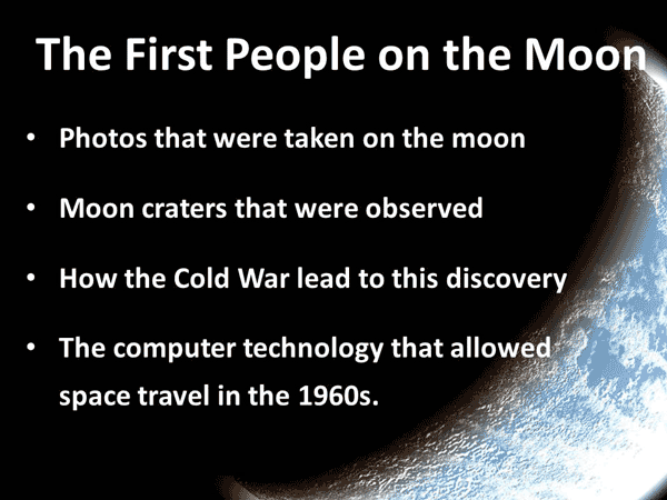
You may agree that the first slide uses humor and controversy that may lead to the audience being more attentive wanting to find out what the speaker’s opinion is. The second slide simply states facts and some of the bullet points are too long. The audience might read the bullet points and conclude that they already know everything they ever wanted to know on the point and stop listening.
Additionally, you may want to offer your audience handouts of your slides before or after the presentation to allow them to make their own notes and to increase the impact of your content. PowerPoint has an automatic “Create Handout” feature that allows you to print slide notes in a variety of useful layouts.
* Appropriate Slide Design
The next step to creating a great PowerPoint presentation is to ensure you pay attention to the design of your slides. Slide design is a difficult and somewhat subjective balance to strike, for example, what looks great to one person may irritate someone else. The content of a talk dictates the design to a great extent and is the deciding factor in whether the design is formal, fun, educational or business orientated. Additionally the demographics of your audience, for example their age, sex, educational level, culture, etc needs to be considered to ensure your slides appeal to the audience and does not cause offence.
When designing slides, consider the following:
1. Information overload alert.
Insert one main point, a sub-point and about four bullets per slide. Each line should be no longer than around five words. Keep it simple and snappy.2. Proofreading paranoia. Spellcheck your slides, proofread them, have someone else proofread them. Imagine yourself standing in front of room, or worse, a hall of people all judging your spelling ability (or lack thereof). Avoid this by being super paranoid and checking each word and sentence several times over before finalizing your presentation.
3. Neutral is good. If you are unsure of the demographics of your audience, it is better to stick to a neutral theme. PowerPoint comes pre-packed with a multitude of beautiful and plain designs that you can apply to your presentation with the click of a button.
4. Consistency is key. Slide design should be consistent. Decide on a position for headings and bullet points and do not change the position on subsequent slides. Don’t use a multitude of fonts and font sizes, decide on a font to use throughout the presentation and vary the font size and style by using bold and italic to emphasize points. Use the same color theme throughout the presentation so that any text, table, graph and other element, creates a unified design.
5. Content and tone. Match the tone of your slides to the content of your talk. If you are presenting a wacky talk on why introverts secretly rule the world use fun themes, colors and fonts, but if you are presenting financial projections and figures to your boss, you may want to use a more formal layout.
6. Visual Attention. Use easy to read fonts and be wary of dark backgrounds or images that obscure the text. Playing with the color of your text so that it is contrasted to a dark background may solve this issue. Ensure your font size and line spacing allows for your points to be easily visible from a distance.
7. Avoid Animation Overload. It may be tempting to use as many of the amazing slide transition and animation special effects as possible in your presentation, but unless you want your audience to make notes of your animations and ask you how you created them, rather stick to one or two professional ones.
Study the slide below which forms part of a management presentation given to a group of department heads at a formal meeting. Critique all the design problems you can observe:

If you said everything is wrong with it, you are not far off! The layout is terrible, the background is too dark and the text is crammed together and too small. The content is far too wordy and does not create suspense or intrigue. There are glaring spelling and language errors and some of the content does not make sense. The font and alignment of text boxes are inconsistent and the overall design of the slide does not match the formal setting the slide was created for (a management meeting with department heads).
Less is more is key in everything you do in PowerPoint. Cramming as many elements into a slide to wow people with your design skills, is rarely a good plan. People should not walk away from your talk remembering your slide design, pictures or animations, but instead should be thinking about and recalling the content of your talk.
* Using Multimedia Elements
Using multimedia elements such as videos and photos or an animated graph, can all aid in keeping your audience’s attention. You can even use these elements INSTEAD of using words. A short powerful video clip about the topic you are going to be speaking on is an instant attention grabber. Using photos to demonstrate parts of your talk will bring the subject to life and a visual representation of statistics and financial figures, will all aid in the understanding of your content.
PowerPoint 2010 offers a wide array of functions that allow you to embed, edit and manipulate videos, photos and graphical elements. This means you do not have to exit or pause your presentation to display these elements as they will be inserted in the slide stack of your presentation.
When considering the use of multimedia to enhance your presentation, consider the following:
1. Ensure the content is relevant. Finding an amazing video or photo that you want to share but which is not explicitly connected to your content, will leave your audience puzzled and distracted.
2. Quality above quantity. Your video clips, photos and other multimedia elements must be of a sufficiently high. A pixelated photo or video that is too small or has poor sound quality, will leave your audience frustrated.
3. A picture speaks a thousand words. Replace textual slides in your presentation with an image that communicates the same message. For example, instead of listing points about how a company is performing financially compared to a previous year, use a graph to visually illustrate this.
4. Be parsimonious with multimedia elements. Using too many videos, photos or graphs will make them lose their impact. A few well-placed and planned elements will be far more powerful in bringing your message across to your audience.
Adding multimedia is fun for the presenter and for the audience and can turn a bland topic into an exciting and fun one.
* Managing PowerPoint During Your Talk
It is important that a speaker is confident in managing PowerPoint slides during their talk. It may seem obvious, but is an often missed out aspect of what makes a great PowerPoint presentation. A badly rehearsed presentation will mean the presenter clicking forwards and backwards through slides trying to find their place. Some presenters are not aware of how to launch a presentation and instead they display their slides in the somewhat cluttered design view. If animations or transitional elements were inserted without due consideration for how these will start and end within the presentation, bullet points may appear on a timed interval which does not correspond to the speaker’s comments.
To avoid the above, a speaker should rehearse their talk together with their presentation paying attention to timings and how they will control slides. The speaker should be so confident with their slides that they are not constantly looking at them but instead engaging with the audience.
Finally, ensure that your laptop is compatible with the projector that will be used and always make back-up copies of your presentation on a CD or memory stick that you keep with you should there be a technical problem. Print hand-outs of each slide that can be distributed to your audience should there be a problem and you are unable to use your presentation.
Remember, if all else fails, your talk should be able to go ahead without the use of PowerPoint slides!
Woohoo! Now that you have done the tutorial:
Test your PowerPoint skills with the corresponding FREE Online Multiple Choice
Planning Your PowerPoint Presentation Test (this test cover the first 2 tutorials)
TRY THE RELATED TUTORIAL: Planning Your PowerPoint Presentation Tutorial
TRY THE NEXT TUTORIAL: The PowerPoint Screen Tutorial
TRY THE NEXT TEST: The PowerPoint Screen Test